
One of my shortest (but fondest) career stints happened when I needed to be home with one of my children for an extended period of time. I quit my job and embarked on a one-year adventure as an eBay seller. Every week, I would travel the countryside to attend various auctions. Like folks flip houses, I flipped my auction purchases. I bought, I cleaned, and I sold on. Some sales were super providential, like the time when I purchased two Royal Doulton table lighters for around $20 a piece, only to turn around and sell them for more than ten and thirty times what I paid for them.
Other times, I wasn’t so lucky. I’d find out I’d paid more than something was worth (remember, smartphones weren’t around yet). But somehow, I consistently managed to flip those purchases, too. How did I make it happen? With my handy dandy ‘swipe file.’ You see, I had an impressive catalog collection. Two of my favorites came from the Smithsonian and J Peterman. J Peterman used line drawings (as opposed to photography) and created elaborate stories around their merchandise. Today, I’ve seen Zingerman’s and Trader Joe’s both follow suit with their respective catalogue and flyer. Yes, despite how visual and technology-reliant we are, this technique still works, because it is timeless.
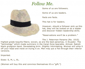 Check out this awesome hat ad from J Peterman’s Rolodex and see what smart stuff they did here. It’s bare-bones — no flashy photography, no debonair GQ gentlemen with their statuesque women — just a hand-drawn picture and some words to accompany it. But there’s a story behind it all, about what will happen to the man who chooses to wear the hat. About how his life will change for the better. It comes down to storytelling, just like in real (fundraising) life.
Thanks to my swipe file and descriptive write-ups, I was able to flip even my worst buys and climb the eBay Powerseller ranks in no time.
So that brings me to this: how can you use swipe files in your nonprofit marketing? I asked two of my favorite nonprofit marketing gurus to share their thoughts on who’s doing email marketing right:
Kerri Karvetski: Routinely inspiring, useful are: Monterey Bay Aquarium, Rails to Trails Conservancy, Emily’s List, EveryTown for Gun Safety, Kaboom.
Nancy E. Schwartz: Add DC Central Kitchen, Environmental Working Group, DoSomething.org (including the “old people” version), Lower East Side Tenement Museum.
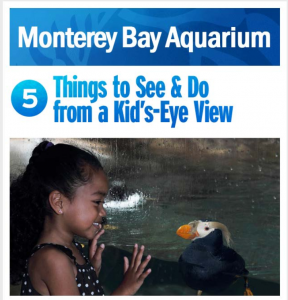
I’ve got three samples for you to add to your swipe file. Monterey Bay Aquarium is clean, focused, and tight. DC Central Kitchen reads like a letter from a friend. And Save the Chimps uses short Happy Friday emails as an enthusiastic way to share the often stale wish list.
A word of caution: swipe files are meant to be used as a source of inspiration, never direct copying.
Care to share some of yours? Send your samples my way. I’d love to see them.










 I can’t wait to meet with you personally.
Comments on this entry are closed.