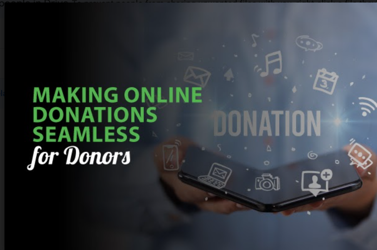
After all of the social media, direct mail, and search engine optimization campaigns that it takes to turn a casual searcher into a potential donor, the last thing your organization wants is to lose that support right at the donation page. Fail to engage online donors and facilitate a positive donation experience, and you might face this very prospect.
Unfortunately, donation form bounce rate is a more common problem than many nonprofit professionals realize. With so much focus put towards marketing, many organizations unknowingly drive away potential supporters and discourage donor retention with a poor online donation process.
To help boost your own donation processes, let’s go step by step through a donor’s journey on your site and address the top three ways you can improve your current giving process :
- Visibility and Website Design
- An Optimized Donation Form
- A Dedicated, Secure Payment Processor
When it comes to pleasing site visitors that you have no information about, it can seem impossible to personally appeal to them and secure their gifts. By optimizing your donation form and website, investing in the right payment processor, and correctly leveraging your post-gift messaging, you will be well on your way to curating the perfect donation experience for current and prospective supporters.
Visibility and Website Design
Before a potential donor even considers making a gift, they will likely explore your website a bit. When doing so, they will make a number of snap decisions based on their first impressions.
A poorly created website can scare donors off and have them clicking away from the platform, and for good reason. Interfaces that are challenging to navigate and have poor functionality not only indicate a lack of professionalism but could be taken as signs of a scam.
By contrast, a well-constructed website with a clear, pleasing interface and effective messaging can keep users on the platform. Furthermore, it will reflect positively on the organization and streamline the donor journey toward the giving page.
Be mindful of the following elements when constructing your own website:
- Easy navigation. Don’t incur the ire of users due to a frustrating or confusing navigation system. Implement a straightforward, easily accessible top menu, and organize your different pages with convenience and clarity in mind. For example, a search feature, clickable links, and a sidebar of similar pages and topics will help make your web pages as navigable as possible. Additionally, make sure that a link to your donation page is always visible. This ensures that no matter where a donor may have landed on your site, they will have a direct portal to make their donations.
- Consistent branding and simple design. Branding and design may sound like purely aesthetic choices, but they are fundamental to your organization’s online image. Consistent branding across all of your web pages will help your nonprofit exude a sense of authority and professionalism. On top of that, a consistent, clean, and simple style will minimize users’ confusion and increase their sense of comfort as they explore your different menus and widgets.
- Impact storytelling. This style of nonprofit storytelling can bring your organization’s cause to life in the eyes of online users. “Impact” or “social-impact” storytelling uses emotional, action-oriented language and personal narratives to describe the direct actions that your organization has taken with donor gifts to create a tangible, positive change in the world. The point of this strategy is to strike a chord with your audience by drawing them in and inspiring them to give.
If you’re still struggling with how to implement these functionality and design improvements to your own nonprofit website, consider contacting a nonprofit tech consultant for further guidance. According to ReCharity’s guide to the top nonprofit consulting firms, these organizations are created to investigate the various donation, marketing, and fundraising needs of your nonprofit. It should be well within the ability of a nonprofit consultant to optimize your website.
Especially during the pandemic, your website is the hub of your engagement with donors. It is the first place that supporters go when they’d like to connect with you, and the last thing that a potential donor will see before they decide whether or not to commit to your cause. With these website best practices, you’ll impress casual searchers and committed donors alike.
An Optimized Donation Form
Your online donation form is one of the final hurdles to securing gifts and even gaining new supporters. No matter how well polished or persuasive the rest of your website has been thus far, a frustrating or confusing donation form experience can exhaust the patience of a potential donor and have them logging out before they’ve submitted their payments.
Maximize the success of your donation page and form with these UX best practices:
- Device optimization. While your entire website should be optimized for mobile, PC, and desktop use, this is especially true for your donation page and form. When their payment details and personal data are involved, users will be far warrier of widgets that aren’t formatting correctly on their devices. For one thing, submitting long strings of information on a faulty interface ranges from aggravating to virtually impossible. On top of that, this may make users feel as if their information is vulnerable to potential leaks or glitches.
- Simplifying your interface. When it comes to creating the frontend design for your donation form, less is more. Online users have an infamously short attention span, and you should make your donation form both aesthetically pleasing and easily fillable. Eliminate unnecessary response fields or convert them into lower-effort widgets, such as check-boxes, when possible. You might even include dropdown or autofill suggestions to speed things along.
- Different giving programs. While one-time donations are desirable, continuous and expanded giving methods are optimal. Don’t forget to promote the following opportunities for increased giving on your donation form: recurring donations and matching gift programs. Recurring donations occur when a donor opts in to automatically donate a certain amount within a fixed span of time, such as monthly. Matching gift programs are a form of corporate philanthropy where a donor first submits a gift, and then their company matches that donation, sometimes exactly or sometimes by multiplied amounts.
- Data collection and post-gift messaging. Collecting the right contact, demographic, and giving preference information in your donation form will allow you to reach out to your supporters with targeted communications and encourage future donations. For example, studies show that donors who received thank-you letters gave $45.32 more on average than donors who did not receive post-gift gratitude. This is just one way that you can easily, seamlessly enrich the donation process for donors. In fact, with the right CRM software and other management tools, you could simplify the process even further by sending out automatic, personalized messages, reminders, and invitations.
These strategies will streamline your donation form to create an easy, simple experience for any potential donor.
A Dedicated, Secure Payment Processor
Imagine this: a potential donor has navigated through the search engine results page, your website, and the bulk of your donation form. They’re finally ready to finalize their payment information and submit their gift. However, right before this critical, last leg of the journey can be completed, a hitch or complication in your payment processor discourages the completion of their donation.
While it’s easy to forget the importance of your payment processor as it operates silently in your backend operations, this program can have a significant impact on your donation form bounce rate and the success of initiated gifts.
To minimize gift abandonment on your platform and streamline the donation process, we recommend looking out for the following features in your own payment processor:
- Integration and dedicated channels. Full integration means that the processor syncs seamlessly with your donation form, avoiding the need to redirect users to a third-party website to complete their payments. More often than not, a fully integrated processor should also be “dedicated,” indicating that it will give your organization its own closed channel to conduct your payment operations rather than sharing the server with other clients. These complementary features work together to create a safer and smoother donation process for your supporters.
- ACH, debit, and credit. Not all donors are willing or able to pay in the same ways. You can maximize your incoming donations by accommodating donors’ payment preferences. Make sure that your processor can facilitate automated clearing house (ACH) payments and those from all of the major debit and credit card companies. This will not only help you to acquire new donations, but it should please your current supporters and encourage retention.
- International processing. Even if your organization is small or local, it’s never a bad idea to accommodate international payments. After all, you never know when your supporters may be abroad. And as your organization grows, this will quickly become a feature that you’ll be glad to have invested in.
- Maximum security. No one wants to give to an organization that they fear might mismanage their payment details and other personal data. Secure your supporters’ trust and safeguard your own operations with a processor that touts anti-fraud protection. For maximum security, ensure that your chosen processor is PCI compliant, meaning that it conforms to the highest security standards set forth by credit card companies themselves.
To learn more about payment processors, special features, and some top solutions, check out the iATS buyer’s guide to nonprofit payment processing for some valuable resources to refine your online donation processing.
Facilitating online donations has never been an easy task, even for the most capable nonprofit organizations. There will always be areas to improve, new designs to consider, and improved processing features to explore. Yet no matter how the virtual giving process may change, these online donation best practices lay the groundwork for what you should always strive to achieve with your own processing. With these resources, your nonprofit’s website could begin boosting donor engagement, retention, and acquisition now and well into your organization’s future.








 I can’t wait to meet with you personally.
Comments on this entry are closed.