With the all-important year-end giving season here, nonprofit professionals like you are busy developing the right messaging that will drive donations.
Let’s complete an exercise to help you get your creativity flowing. Compare the following nonprofit year-end fundraising appeals:
- Our year-end fundraising campaign is right around the corner. We need your help to save more stray dogs in the community. Consider donating to support our mission.
- Stray dogs in your community need help right now. There are only three more days left to get your donation matched by an anonymous donor. Will you give now to deliver life-saving aid to puppies in need?
Consider how you feel after reading each appeal. The first example gets the message across, but it’s somewhat dry and dull, and the donation request feels like a gentle suggestion. On the other hand, the second example uses urgency, a timeline, and power words to inspire immediate action.
What key ingredient is missing in the first example? Emotion!
In this guide, we’ll highlight the following tips to help you improve your nonprofit website’s emotional appeals:
- Tell compelling stories.
- Understand your audience.
- Include images of people.
- Choose emotional words.
- Use colors intentionally.
Along the way, we’ll review some examples of effective emotional appeals pulled from Kanopi’s roundup of best nonprofit websites. Note the strategies used in each example that may also appeal to your audience.
1. Tell compelling stories.
Research has found that emotion-based storytelling in communications can trigger positive reactions through the release of brain chemicals like dopamine and oxytocin. Sharing stories about your volunteers, beneficiaries, staff members, and other stakeholders can introduce potential new supporters to what your mission is all about and facilitate a positive connection with your nonprofit.
Make your storytelling more emotional by using the following techniques:
- Include direct quotes or video interviews of your story’s protagonists. You’ve probably heard of the narrative technique “show, don’t tell.” It’s much more effective to bring readers into the story through the protagonist’s feelings and actions, rather than summarizing what happened using exposition. Including direct quotes or video clips of the protagonist speaking about their experiences can make your storytelling much more emotional and moving.
- Incorporate multimedia elements. Multimedia elements like photos, videos, and audio break up long text blocks and allow readers to form a deeper connection with the subjects of your stories. If your current content management system doesn’t support multiple content types, consider switching to a more robust platform, like WordPress.
- Connect data and statistics to real impact. Data is a powerful way to add credibility to your content, but it’s especially impactful when contextualized through impact stories. Show the connection between data points and the real-world positive impact that they convey. For example, you might share that your organization helped remove 300 pounds of trash from your local lake. The real-world impact of this statistic may be that the lake reopened to the public, allowing community members to host birthday parties and other gatherings.
Weave storytelling through different aspects of your website, such as your blog, donation page, about page, and community testimonials page.
2. Understand your audience.
Audience research is key to any effective marketing campaign. When it comes to nonprofit marketing, understanding the types of emotional appeals that resonate with your unique audience will help you increase marketing engagement and conversions.
Identify your audience’s preferences through the following research strategies:
- Investigate your audience’s interests and giving histories. Comb through your constituent relationship management system (CRM) to understand which types of appeals have been most successful in the past for driving engagement and donations. NPOInfo’s data collection guide specifically recommends reviewing data points like giving history, hobbies and interests, and advocacy participation. This will reveal what your audience is passionate about and willing to devote their time and money to supporting.
- Conduct A/B testing. A/B testing is the process of creating two different versions of a marketing campaign (in this instance, a web page) to determine which version is more compelling for your audience. You can conduct A/B testing by creating slightly different versions of important web pages like your homepage or donation page. Adjust emotional elements like your written appeals, images, or colors to see which version of each page drives more interactions or donations.
- Gather insights through surveys. Surveys allow you to hear directly from your supporters about what motivates them to give. Send a survey to your donors and volunteers with questions about why they support your nonprofit and which aspects of your mission resonate with them the most.
Note any trends or patterns in your audience’s data or survey responses and adjust your appeals to emphasize the aspects of your mission that drive supporters to action.
3. Include images of people.
Images of faces tend to be much more engaging than those without. Through A/B testing research, some organizations have found that using photos of people in web content leads to more conversions than paintings or generic icons.
Enhance your emotional appeals by including photos of people with these characteristics:
- People looking into the camera. Eye contact is more compelling than someone turned away from the camera.
- People displaying the emotion you’re looking to inspire in readers, whether joy, anguish, hope, etc.
- Photos of just one or a small number of people rather than a large group. This is specifically helpful for important conversion pages like your online donation form. Photos of just one or two people tend to be less distracting than photos with many faces.
For example, this image from the Covenant House homepage represents all the best practices listed above: it features just a single person looking straight into the camera with a big smile, representing the organization’s message of hope and joy.
 Alt: This image shows the Covenant House home page.
4. Choose emotional words.
The words you choose for your website’s calls to action (CTAs), blog posts, and other appeals can make a major difference in whether someone chooses to support your mission. Here are some examples of power words to use based on the emotion you’re hoping to evoke:
Alt: This image shows examples of compelling power words to use in your nonprofit’s emotional appeals (outlined in the text below).
Convey urgency
- Act now
- We need your help now
- [Community name] urgently needs your help
- Make a difference right now
- Give now to have your donation matched
- Help us deliver life-saving aid
Inspire action
- You can make a difference
- Join the fight
- Fight for change
- Kickstart change in your community
- Give now
- Be the change
Promote inclusion
- Join our community
- Join the team
- Become a changemaker
- Join the movement
Check out this example of an effective CTA from the CARE website. It uses a combination of compelling words and an eye-catching image to encourage website visitors to give now to support the cause.
 Alt: This image shows a call to action on the CARE website. The main headline is “Help Save Lives in Times of Emergency!” There is also an image of a girl looking into the camera with a somber expression.
5. Use colors intentionally.
Color psychology is the study of the way that colors impact human behavior and emotions. It’s no secret that the colors brands use in marketing have an impact on the way we view those brands — think of the feeling you get when coming across the iconic McDonald’s golden arches on a long road trip, for example.
Your nonprofit likely already has a color scheme that you use in your branded materials, including your website. You may also use a variety of secondary colors across different website aspects like your CTAs, links, or buttons.
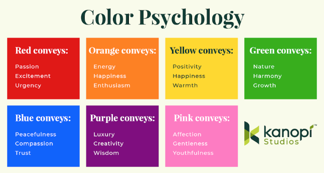
Your nonprofit’s primary brand colors are probably set in stone, but you may have more flexibility in using secondary colors across your website. Choose your secondary colors carefully based on the action you’d like to inspire in your audience. Consider the following colors and the emotions they tend to evoke:
 Alt: This image explores different colors and the emotions they evoke (explained in the text below).
- Red: passion, excitement, intensity, urgency, determination
- Orange: energy, happiness, youthfulness, enthusiasm
- Yellow: upbeat, happiness, warmth
- Green: nature, harmony, growth
- Blue: calm, compassion, trust
- Purple: luxury, creativity, ambition, wisdom, mystery
- Pink: affection, gentleness, youthfulness
Keep in mind that color connotations vary across cultures, generations, and gender. Conduct audience research and A/B testing to understand your audience’s traits and anticipate how they may respond to different color options.
If you need some advice on how to use your nonprofit’s unique brand colors in a way that inspires emotion and action, consider working with a nonprofit web design consultant. These professionals can offer guidance and help conduct audience research to determine which color combinations will best support your fundraising and marketing goals.
Infusing your marketing efforts with emotion is a fundraising best practice that you should carry across marketing channels, from your website to email outreach, social media posts, and direct mail campaigns. Supporters with strong emotional ties to your cause are more likely to give regularly and in larger amounts. Keep these tips in mind the next time you refresh your website to develop a more compelling user experience and generate the support your nonprofit needs.


 I can’t wait to meet with you personally.
Comments on this entry are closed.