In my first nonprofit job, the organization I worked for had no online presence. In 2001, not having a website wasn’t at all unusual for a nonprofit organization. Small nonprofit organizations, in particular, have a tendency to fall a bit behind the technological curve. And people were initially cautious to use their credit cards online. But I knew that I wasn’t (as a mom who worked full-time and attended college at night, my most stress-free Christmases were those I shopped entirely online) and that online giving was sure to eventually play a major role in individual giving.
I spoke with our board and volunteers about the importance of a website but didn’t get anywhere. Our volunteers were simply too busy or lacking the technical skills to design and launch a website. And our board didn’t view it as a priority.
So I began looking into how I could get a website up and running without having any background in html coding. A WYSIWYG editor seemed my best bet. WYSIWYG simply stands for “what you see is what you get,” and it provided a framework for a non-techie like me to design a website without learning coding.
I settled on Microsoft’s FrontPage, which, according to wiki was “a WYSIWYG HTML editor and web site administration tool from Microsoft for the Microsoft Windows line of operating systems. It was branded as part of the Microsoft Office suite from 1997 to 2003.”
Two days later, our first website was up and running.
I hated it.
It was ugly and it was clunky (and if you remember FrontPage, you know exactly what I’m talking about.)
It was then that I discovered Dreamweaver and, after another three or four days learning how to manipulate that software we had an improved, sleeker site online, one that featured online giving. I tell you this story not to brag, but rather to show you what the power of having a strong strategy, focus and losing your fear of technology can accomplish.
Since then, I’ve lost count of the number of organizations that I’ve worked with personally who have:
- either spent an excessive amount of money on their website, and/or
- been utterly beholden to their webmaster for the simplest change to their site (if your webmaster is charging you $150 for adding a list of names to your site, you’re being overcharged), and/or
- completely lost touch with the original creator of their site, as well as passwords and hosting information.
People: your organization’s website plays a critical role in your fundraising strategy. It needn’t be complex and it should not cost you an arm and a leg. First, you need to get it through your head that building a website is not the convoluted process it once was.
Yes, the days of html coders commanding $150 an hour are behind us.
How simple can it be?
How’s this for simple?
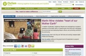
Note how the featured site for Oxfam is free of clutter. The design is sleek, clean, and it is clearly designed with the donor at its focus. When creating your site, keep these pointers in mind:
- Your organization’s social media links are easily located, preferably top right
- You want a nice looking headline (see the Oxfam example) with a photo or video. One that touches the heart.
- You’ll want a donate button located above the fold (which means that the visitor doesn’t have to scroll to see it)
- Your email signup should, likewise, be located above the fold.
- Impact is immediately discerned.
- Navigation is easy to understand. Remember your site is meant to engage donors and prospective supporters.
Keep your website clean, focused and uncluttered. To put it bluntly, cut the crap from your homepage. This means no Goodsearch toolbar.
Spend some time mapping out the strategy for your organization’s website before determining whether you will hire a developer or do it yourself. Get a feel for what works by exploring as many nonprofit websites as possible. Don’t fear technology or be intimidated by the thought of putting up your own site. When you clearly understand how something works for yourself, you can tell good advice from terrible (and typically expensive) advice. This is your site, own it.
Lastly? Record all information pertaining to your website and maintain it in your development binder. This includes your ftp upload passwords, cpanel passwords, WordPress passwords, your domain registration and hosting company user names and passwords.
Reprinted from Simple Development Systems, your guide to small shop donor-centered fundraising.






 I can’t wait to meet with you personally.
Comments on this entry are closed.