“When written in Chinese, the word “crisis” is composed of two characters-one represents danger, and the other represents opportunity.”
John Fitzgerald Kennedy
“We need an annual report…yesterday!”
Those were the words from my supervisor, the director of development. The year was 2003 and I was insanely busy in my second position in nonprofit fundraising, grantwriter for a regional organization serving women and children. Although I’d been hired only weeks earlier to develop cultivation and solicitation strategies for corporate and foundation prospects, already I’d been called off task any number of times.
And now I was given the assignment of creating my first annual report.
I had seen any number of nonprofit annual reports during my work with a regional grantmaking organization — some slick, glossy tomes, others printed up on the office inkjet printer, and others falling somewhere in-between — but where would I start? I went back to the organization’s archives of annual reports to get a feel for layout and content.
And that’s when the challenges began multiplying…
- During the preceding year, the organization had gone through a renaming and “re-branding” process. This year’s annual report would introduce the public to both.
- The outcomes from the agency’s many programs were not reliably available to me, thanks to a change in their computer systems resulting in lost data.
- My budget was virtually non-existent.
- The entire report, from concept to written and design, needed to be completed within a two-week time frame.
We fundraisers are nothing, if not agile and up for a challenge.
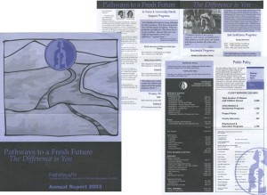 Originally known as the Women’s Association for Women’s Alternatives (WAWA), the organization had re-branded itself since the last annual report, and was now known as PathWays PA. The cover design highlighted the suggestion of “pathways out of poverty,” leading to the agency’s new logo.
Creating a theme
In past years, the agency’s annual report had relied on numbers, lots of them. After all, we had programs in home and community family support, truancy, residential, self-sufficiency, and employment. And the tendency had been to cover each one of them in detail. I made the decision to focus on just one key story, and make the donor the heart and center of the annual report. The theme, “The Difference is You,” evolved and was woven throughout the report by including testimonials from donors, volunteers, and foundation and corporate supporters.
Owing to budget constraints, I made the decision to go with one color on a standard newsletter stock, and a scant four pages (half the size of our previous annual reports).
The result
While the 2003 annual report came in with considerably less detail and sophistication than our supporters were used to, it was focused on what was made possible through them and generated more calls and positive feedback than any prior report.
Lessons learned
I learned a few valuable lessons with that first annual report:
- Maintain a solid yearly communications calendar to lessen surprises,
- ‘Challenges’ nearly always translate to ‘Opportunities,’ (it’s all perspective)
- Know your organization’s stories, and, most importantly
- When you focus on your donors you can’t go wrong.











 I can’t wait to meet with you personally.
Comments on this entry are closed.