The quest to optimize the online giving experience for donors is a never ending one. This isn’t a question of “set it and forget it.” The savvy fundraiser is always paying attention to how individuals interact on their website. And because I am always learning and trying to make things better (and I’ll bet you are, too), there’s no endpoint in sight. Like many things in the nonprofit world, it’s a journey.
But great examples can help us along the way. And so I present you with yet another Inbox installment, this one from Doctors Without Borders, an renowned international humanitarian organization founded in Paris, France, in 1971. DWB’s efforts are concentrated in locations of greatest need, so their staff (doctors, nurses, and other medical staff) work primarily in war-torn regions and third-world countries.
DWB has sought to optimize their online giving process and in keeping with that, they’ve simplified it and made it donor-focused. Check out what their donor experience looks like…
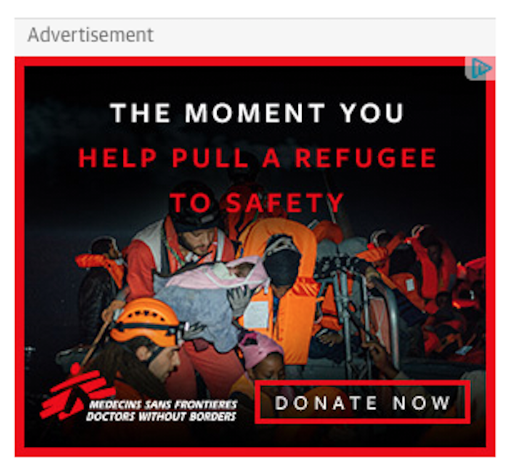
Some key things I noticed:
1. The compelling ad puts you, the donor, at the heart of the mission.
2. How do you want to give? DWB covers all of the bases, offering the option of credit card, check, PayPal, and even Amazon Pay!
3. EVERYTHING is carefully thought out and planned. For instance, if the donor selects the option of check, there’s the opportunity to view your state’s returned check fee.
4. The form itself is clean, uncomplicated, and free of necessary fields.
5. I HATE receiving texts and appreciate that they’re asking if it’s okay to send them, rather than just sending them.
6. May we share your info? Many hate receiving unsolicited mail from nonprofits, but here DWB give you a perfectly logical reason for why.
7. They’re giving me a contact if I need help making my donation, and the option to speak with a real person is always comforting.
8. Right on the donate page, they’re very clear about how my funds are used.
9. This form has been optimized for mobile, as well — the simplicity extends across all channels!
You know that creating your organization’s donate page, and offering your supporters a pleasant, donor-friendly experience, won’t happen overnight. You want it accessible. You want it easily-navigated. And you want your donors to want to come back to it. Like we said before, it’s a journey. So test and tweak it, and test it again. You’ve not only got the tools you need right at your disposal, you’ve got yourself. So start out by making a gift on your nonprofit’s page today, see what the donor experience looks like, and go from there.
Tagged as:
What's in my inbox








 I can’t wait to meet with you personally.
Comments on this entry are closed.